The Book Room App
Project timeline - March 4th - March 28th, 2025
The Book Room app was created to transform the way readers participate in and manage online book clubs. The goal was to create a standalone, creatively independent app that integrates with Amazon Apps while offering clear, structured, and engaging discussion features.
Problem
Current platforms fail to provide the structure, personalization, and engagement tools readers and moderators need to run effective book club discussions.
Solution
The Book Room delivers an organized, user-centered platform that supports vibrant, structured conversations and easy club management—while maintaining the flexibility of Amazon integration and creative independence in design.

Understanding the Problem
The project began by identifying core user pain points through our persona, Ava—a book club moderator managing both local and remote groups. Research revealed key challenges:
Disorganized conversation threads that make it difficult to follow or maintain meaningful discussions.
Limited discoverability of book clubs that align with her reading interests or location.
Few opportunities to connect with other readers outside of existing platforms, making community-building a struggle.
These findings shaped our problem statement and guided the design of a more structured, intuitive, and socially connected platform.
Gathering User Insights
To better understand user behaviors and expectations, we conducted seven user interviews and usability tests on competitor platforms. Insights from these sessions revealed common frustrations and goals around digital book club participation.
We synthesized this feedback through affinity mapping to uncover recurring themes, which informed our user personas and clarified the core needs that would shape our design strategy moving forward.
The User
Ava
Age: 64
Occupation: Retired Lawyer
Ava recently retired with her husband to Miami FL and is looking to continue her passion for book clubs alive. She loves being a hostess, and during her career she found that book clubs were a great way to escape the stress of her career. She is excited to start a new book club in a new area, but needs help finding people to engage with, and a way to maintain her existing book club back in Chicago.

Dissecting Competitor UX Strategies
To inform strategic design decisions and uncover opportunities for innovation, a comprehensive competitive analysis was conducted on leading book club and reading platforms. The objective was to assess user expectations, identify feature gaps, and highlight areas for meaningful differentiation.
A detailed feature comparison chart was developed, mapping functionality, content organization, and user engagement tools. This visual benchmark established a clear picture of how current platforms support book club communities—and where they fall short.

Captured and Analyzed Competitor Screenshots
Screenshots from various competitor platforms were collected and reviewed to evaluate user interface patterns. This analysis helped distinguish which design elements promoted engagement and which introduced friction. By examining both effective and problematic interactions, common usability pitfalls and successful UI strategies were identified.
Identified Strengths and Gaps
The review revealed clear trends, some platforms excelled in community-building features like forums and event scheduling, while others struggled with navigation and content clarity. These findings highlighted where current solutions underperformed and where opportunities existed to add meaningful value.
Recognizing these patterns and gaps provided a strong foundation for designing a product that feels both innovative and functionally solid.
MoSCoW Analysis
With a wide range of features identified through research and ideation, a MoSCoW analysis was used to strategically prioritize what to build first. This framework helped categorize features into Must-haves, Should-haves, Could-haves, and Won’t-haves for now, based on user needs and technical feasibility.
This approach ensured the feature roadmap remained user-centered, and realistic, focusing development efforts on solving the most critical problems first.

Strategic Direction - Standalone iOS App
Research findings pointed to the value of developing a standalone app, independent of the Goodreads/Amazon ecosystem. This direction provided clear strategic benefits:
Original Design Foundation – Freed from Amazon’s constraints, the app could be fully shaped by user needs and research insights.
Innovative Feature Opportunities – Allowed for the creation of competitive, user-driven features beyond what existing platforms offer.
Wider Audience Reach – Made the app accessible to users outside the Amazon ecosystem, broadening its appeal.
Scalable & Adaptable – Positioned the product for future integrations (e.g., Nook, StoryGraph) and responsive iteration based on user feedback.
This foundational decision was guided by research and ensured that every design and feature choice aligned with both user value and market differentiation.
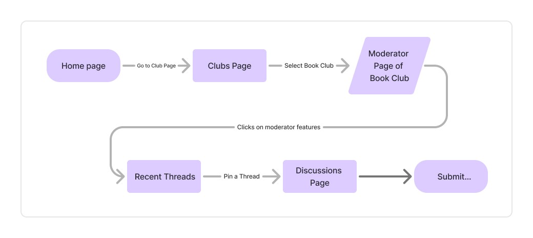
Task Flow Design: Supporting Moderators Through Structure
Guided by research insights, a task flow was created around the needs of Ava, a book club moderator frustrated by disorganized and low-engagement discussions. The flow streamlined key actions such as setting up discussions, planning topics, and prompting member participation.
This structured approach was designed to reduce moderator effort while fostering a more active, connected book club experience.
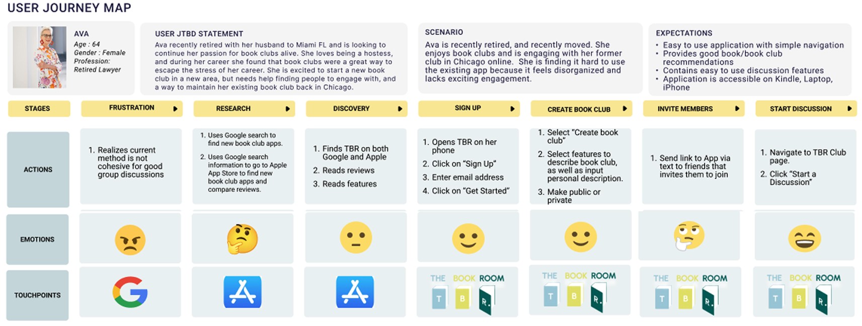
Journey Mapping: Visualizing the Moderator Experience
A user journey was mapped to illustrate Ava’s experience—from initial frustration with existing tools to feeling confident in managing her book club. This process revealed both emotional and functional challenges, including cluttered interfaces and difficulties maintaining member engagement.
By visualizing her path, key pain points were identified, leading to actionable insights for improving the app’s user flow and better supporting her goals with a more efficient, enjoyable experience

Fueled by insights from user interviews, usability testing, and a shared design vision captured in our team’s mood board, we began bringing The Book Room to life.
Drawing on our collective expertise in Figma, we translated research findings into thoughtful design decisions—balancing user needs with creative inspiration. This phase marked the transition from exploration to execution, where ideas took shape and the foundation for a meaningful, user-centered reading experience was set in motion.


High-Fidelity Mockup
The high-fidelity prototype was designed to reflect user research through intuitive, mobile-friendly flows. Each screen supported key tasks like starting clubs, browsing discussions, and managing reading lists, with careful attention to layout and clarity.
Usability testing confirmed the design’s effectiveness—users praised its simplicity, structure, and ease of navigation. The result was a clean, engaging experience aligned with real user needs.
Figma File
Let's Connect!
I believe great design starts with great conversations. Whether you're a fellow designer, recruiter, or just curious about my work, I’d love to hear from you.